23 Popular Websites That Have Changed Drastically Over Time
kilgore9012
Published
01/30/2019
in
wow
Since the #10yearchallenge is making its way around the internet, take a look at how some of the most visited websites on the internet have aged during the last 10 years. Everything from Amazon to Yahoo have felt the grip of father time and the constant need to evolve with the times.
- List View
- Player View
- Grid View
Advertisement
-
1.
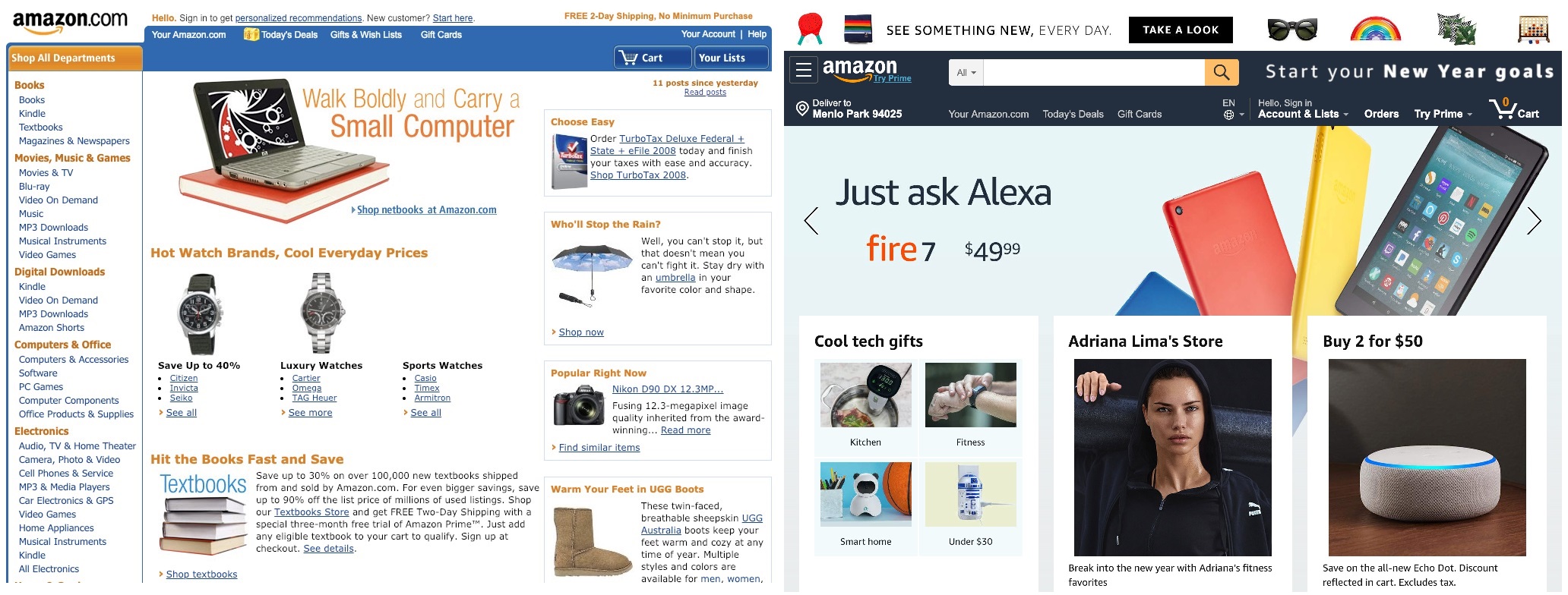 Amazon has branched out into new products and services, and taken a larger share of the market. Their website, however, seems to have simplified, and become even easier to use. Many people use their site for everything from groceries, to Christmas gifts.
 -
2.
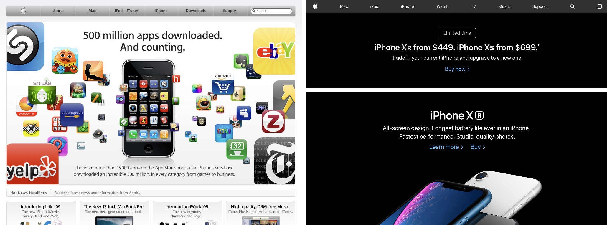 Seeing as how the apps sell themselves, Apple has decided to change focus. Along with their sleek new design, they are also pushing the phones over the apps.
 -
3.
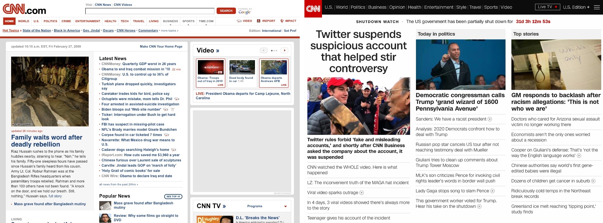 CNN has simplified and taken away the color text, just like New York times. They don't quite look like a printed newspaper yet, though.
 -
4.
 Craigslist has changed the least of any of the websites shown. Aside from some rearranging, it's all the same. You can still buy or sell a used mattress, jewelry, and vehicles, but you won't be hooking up in the casual encounters anymore as the site has bailed on that section entirely.
 -
5.
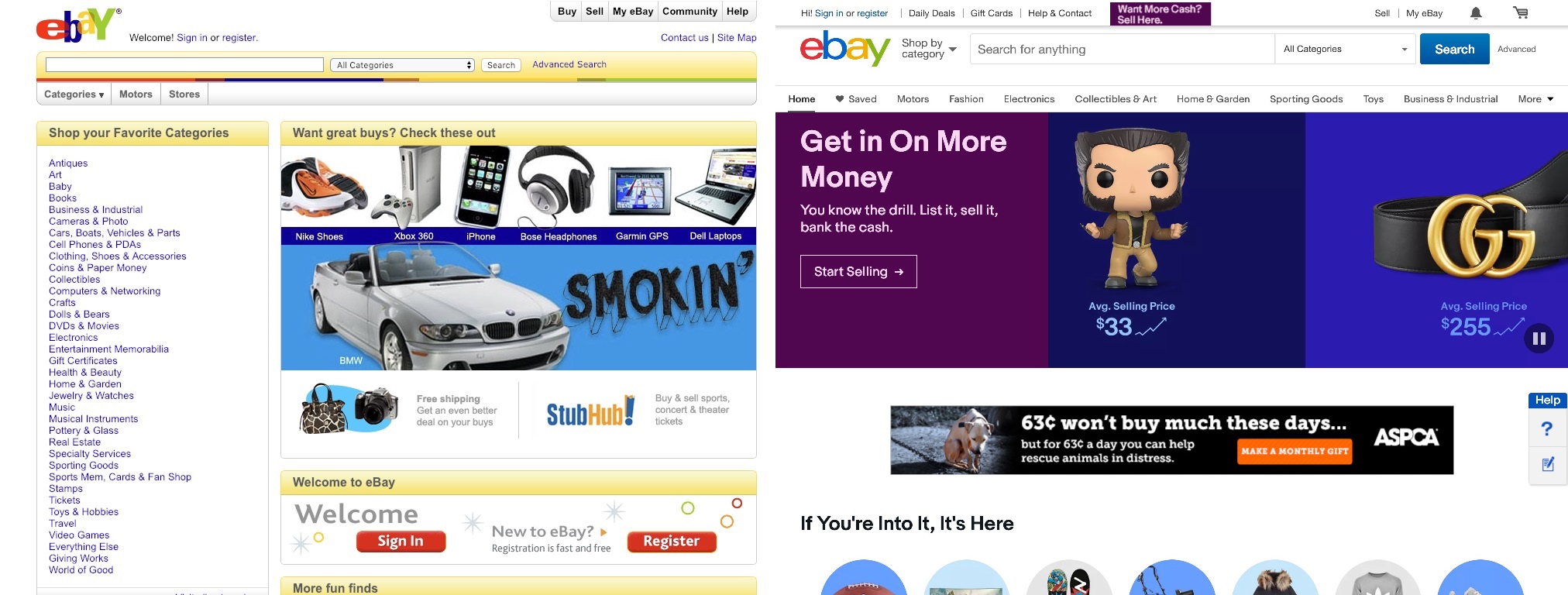 Ebay has put a lot of work into reminding it's users that it is both a buying and selling site. They've also hidden some of the more cluttered parts of their page behind tidy menus.
 -
6.
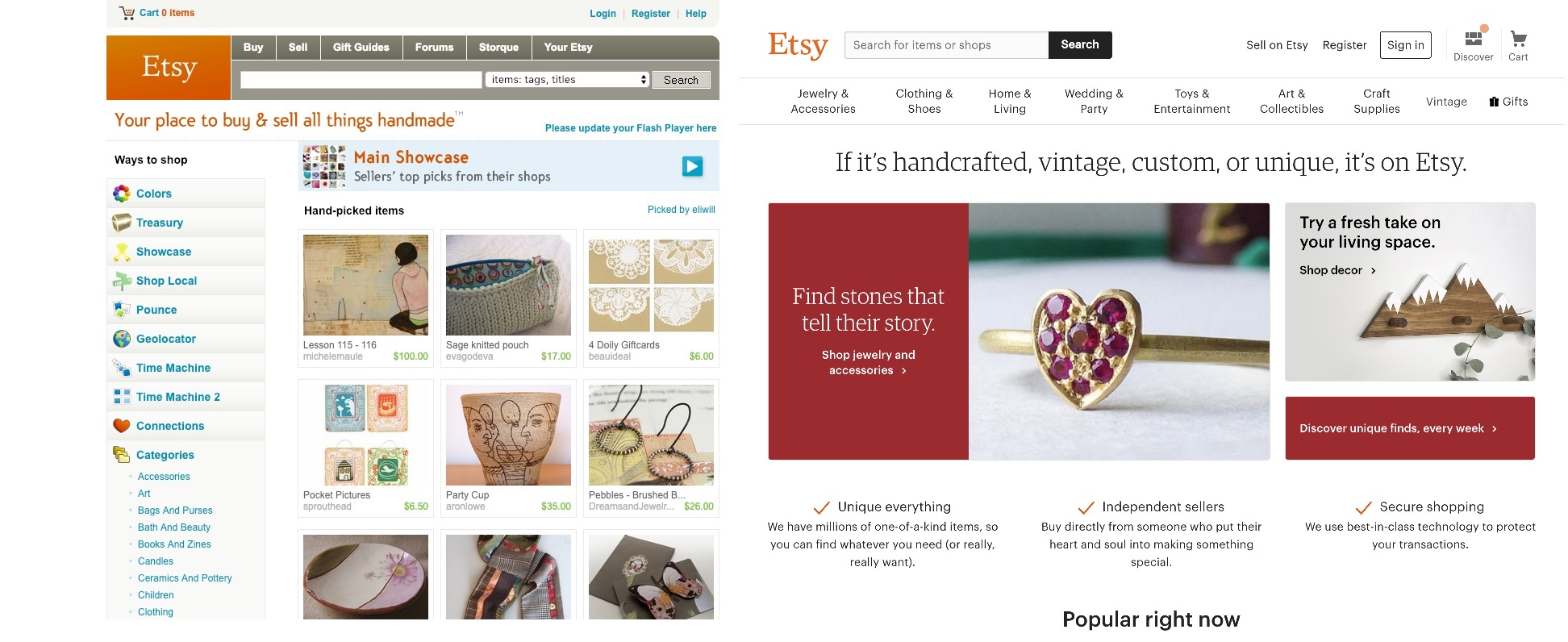 Etsy has changed their whole business model. No longer focusing solely on homemade items and crafts, they have now branched out to vintage, custom, and unique items. They've also simplified their homepage and menus.
 -
7.
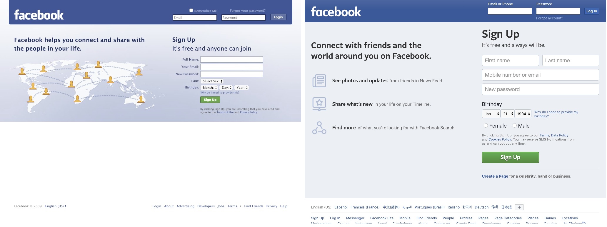 Facebook has changed (for better or worse) an extreme amount over the years. Pretty much everything from your profile to your timeline to what posts you see, have all changed but the login page is a prime example of 'If it's not broken, don't fix it.'
 -
8.
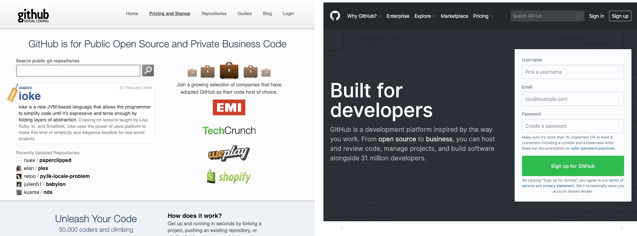 Built by programmers, for programmers, Git Hub has changed it's look, but not it's mission. 10 years ago, they were barely a year old, but now they're a go to site for open source code.
 -
9.
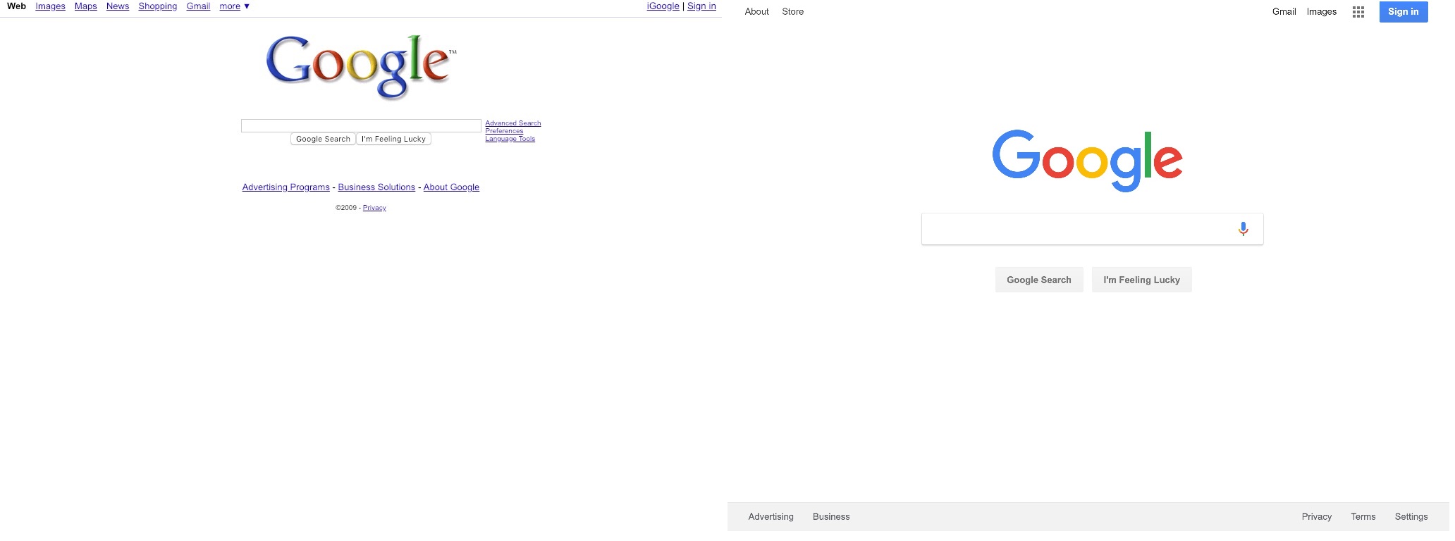 Google hasn't had many changes since it's 2015 logo alterations, but it does have a cleaner, and more minimalist look. They did add the feature that, provided you have a microphone, you can simply tell google what to search for and save on typing, though.
 -
10.
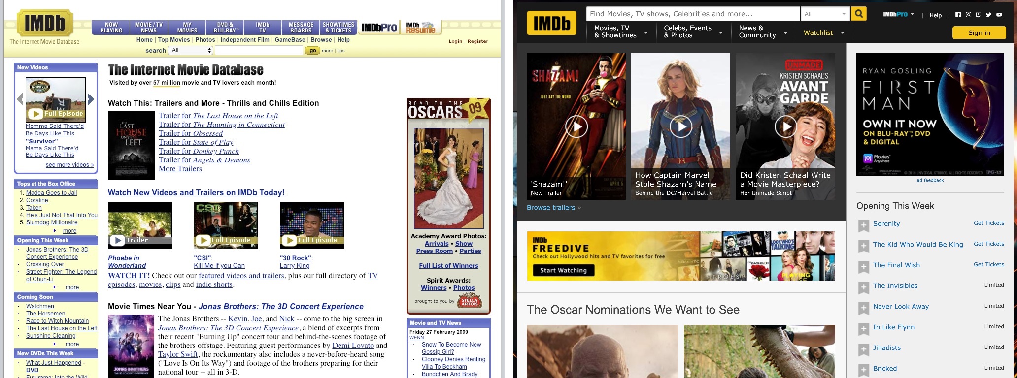 Imdb has changed quite a bit. From their layout, and color scheme, all the way to the content they feature. Still mostly used for remembering if that one guy is the same as that guy in the other movie. And didn't he voice that one cartoon, too?
 -
11.
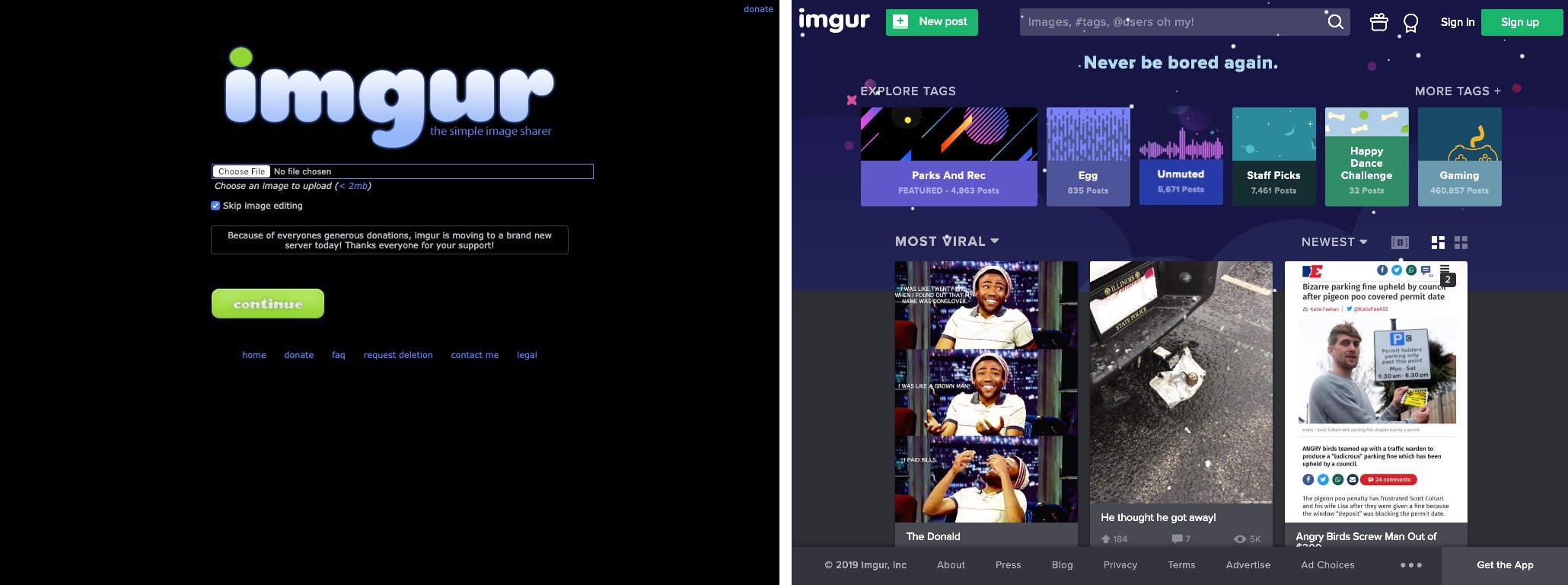 Built by a college student, imgur started out as an image host site for redditors. This page has evolved by leaps and bounds, and on top of being a household name, it's front page is drastically different from it's original layout.
 -
12.
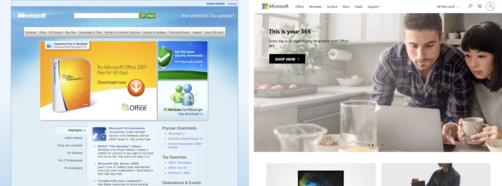 Microsoft hasn't just changed it's entire layout. They've even changed the featured products and services that they are providing to their customers.
 -
13.
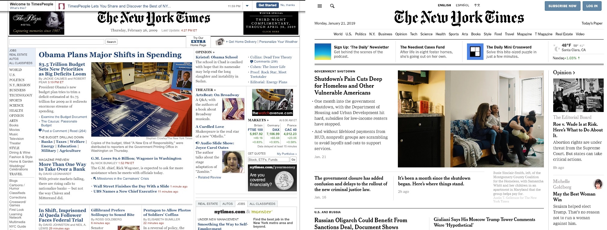 The New York Times has come full circle. Having dropped the use of colored text, and adopting a simpler layout, their website looks more than ever like a printed newspaper.
 -
14.
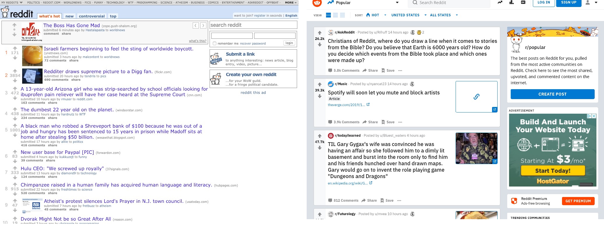 Reddit had very little visible change until around 2018. Their new look has a cleaner, less cluttered feel. Don't worry, though. All of your favorite sub-reddits are still there.
 -
15.
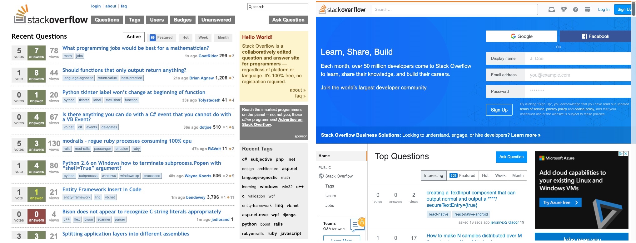 Stack Overflow has changed the homepage focus, from answering questions, to signing up, or signing in.
 -
16.
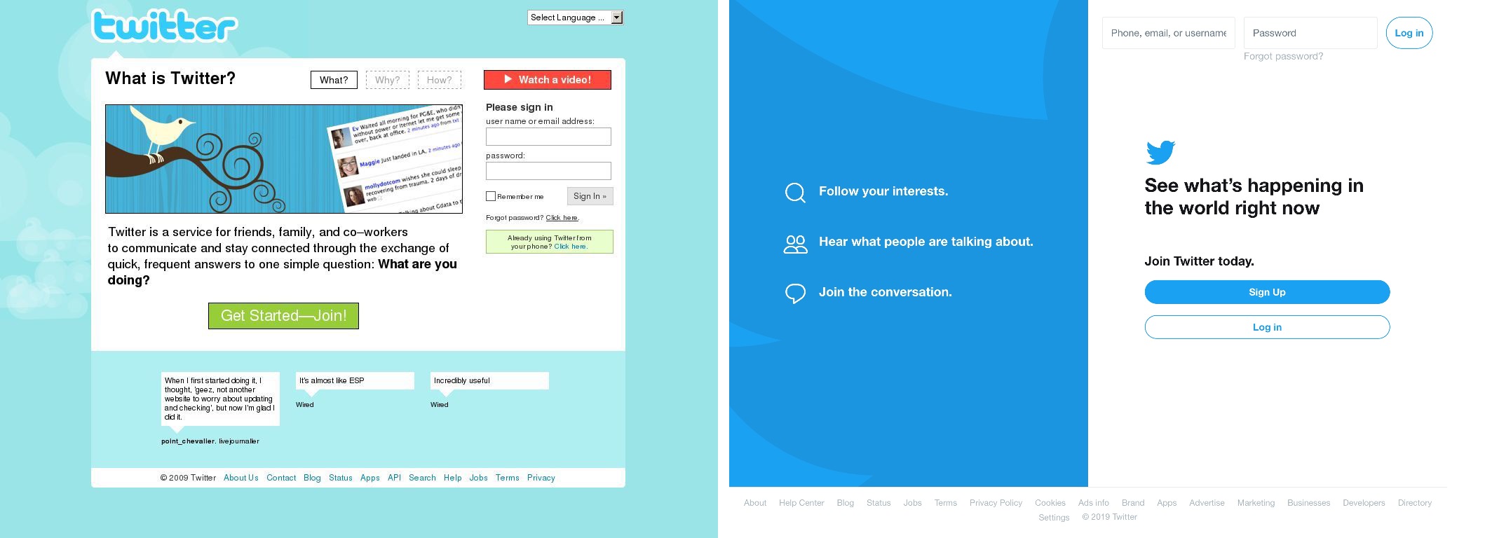 10 years ago, when they were still making a name for themselves, Twitter had a "What is Twitter?" explanation on their front page. Now that they have become a household name, they have adopted a much sleeker, and more streamlined aproach.
 -
17.
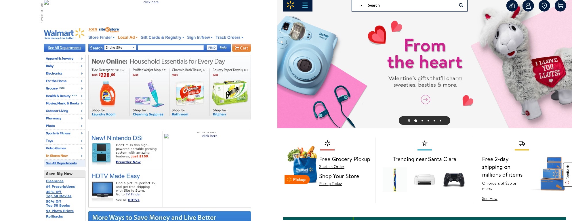 Walmart has also chosen a simpler look. With their new free grocery pickup, they've not only made their site easier to use, but also their store. Will this be the end of 'People of Walmart'?? Dun dun duuuun!
 -
18.
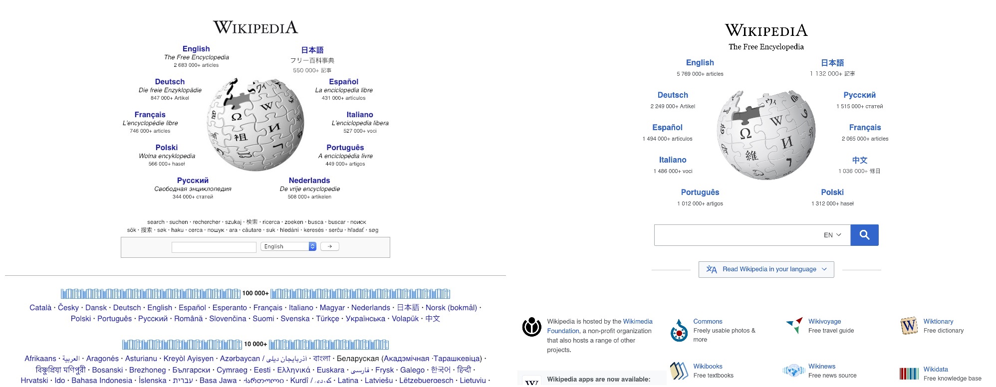 Wikipedia has seen some subtle changes. It's spherical logo, and the languages around it have been updated. The icons below the search bar have also been cleaned up and simplified, but this paragon of knowledge remains for the most part, untouched.
 -
19.
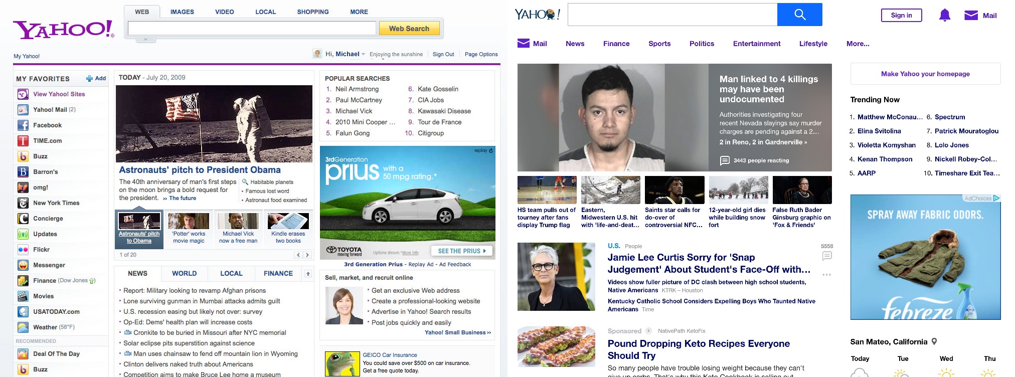 Yahoo has changed it's logo, and color scheme, but they still try to pack as much eye-catching information as possible onto their page.
 -
20.
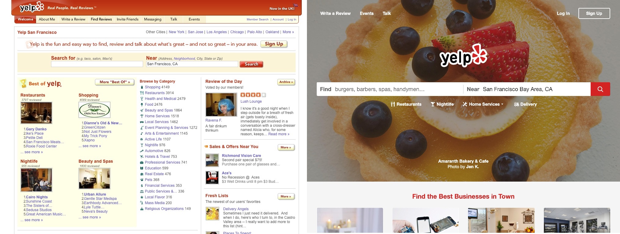 Yelp has gone with an amazing new minimalist look by having you search for what you want, instead of throwing all of your options in your face. A much simpler, but also more colorful view. (edited)
 -
21.
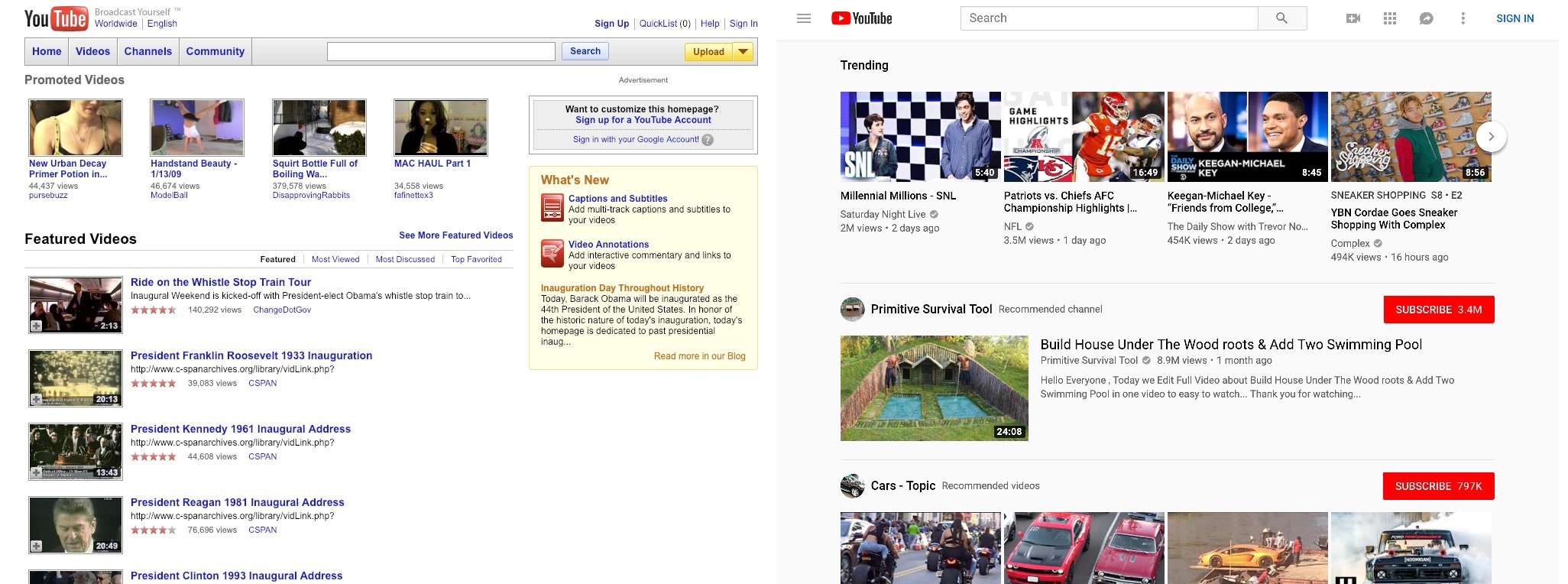 YouTube has been a subsidiary of Google for the last 12 years, and over the last decade, there have been quite a few changes made. Like most of the internet, they have adopted a more minimalist look. They've also had a change of logo, and and added a pre-view feature. Like with Pornhub, if you hold your mouse over a video thumbnail, a few seconds will play on a loop.
 -
22.
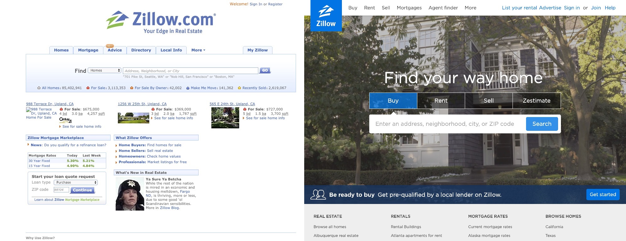 By focusing more on the most common uses for their site, Zillow has tidied up their homepage. They even have a neat new thumbnail logo.
 -
23.
 eBaums was launched in 2001 and has gone through many changes over the years. From a humble site updated once a week to a full time entertainment destination. Now there's streaming gameplay on Twitch, as well as Twitter, Instagram, Facebook and Flipbook pages dedicated to the site. If you're a longtime visitor we appreciate the support, or this is your first time here, welcome and we hope you enjoy!
- NEXT GALLERY
-

- 19 Photos that Show How Time Changes Everything
Amazon has branched out into new products and services, and taken a larger share of the market. Their website, however, seems to have simplified, and become even easier to use. Many people use their site for everything from groceries, to Christmas gifts.
23/23
1/23
Categories:
Wow





24 Comments